On this page
Overflow Menu
An overflow menu tucks secondary or contextual actions behind an icon-only "more" button.
- Overview
- Rules and guidance
- Properties
- Styles
- Accessibility
Overview
When to use
- To offer secondary or contextual actions that don't fit the primary UI. The most common place is a row in a Data Table, but it also suits a Card.
- When there are several actions for the same item and showing each as its own button would crowd the layout.
When not to use
- For a single action - show it directly as a standalone icon-only CTA Button instead of hiding it behind a menu.
- For the primary action on a page or in a form. Keep it visible.
- To choose a value. This is a menu of actions, not a replacement for Select Field or Combobox Field.
Anatomy
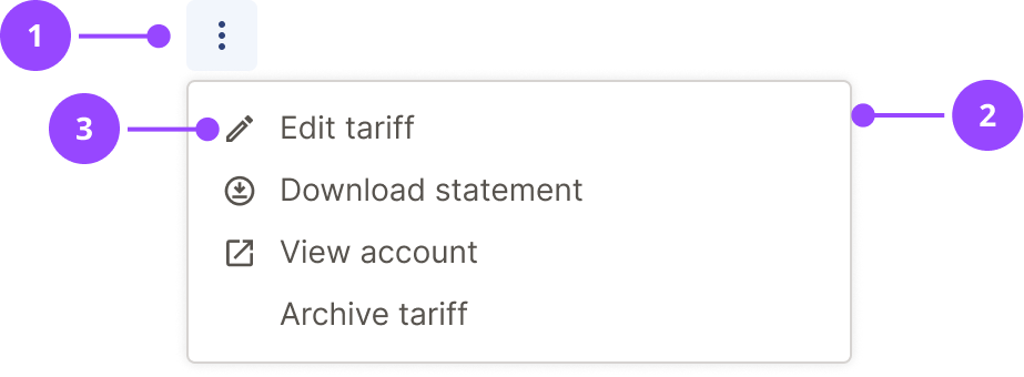
- Trigger: an icon-only CTA Button showing the vertical ellipsis (kebab) icon. Hovering or focusing it shows a tooltip reading "More actions".
- Menu: the list of actions, attached directly below the trigger. It is 300px wide, and grows up to 350px to fit longer labels. Each item has a label that describes the action that will be performed.
- Icon: an optional icon before the label.
Basic usage
Edit live code
<OverflowMenu
  items={[
    { label: 'Edit', icon: 'edit', onClick: () => alert('Edit') },
    { label: 'Download statement', icon: 'download', onClick: () => alert('Download statement') },
    { label: 'View in new window', icon: 'new-window', onClick: () => alert('View in new window') },
    { label: 'Archive', onClick: () => alert('Archive') },
  ]}
/>
Each item has a label, and optionally an icon, destructive, and one of three kinds: a button with an onClick handler, a link with an href, or a router link with as and to. See the Properties tab for the full list.
Actions and links
Use onClick for something that happens on the page, such as archiving or deleting. Use href for an item that goes somewhere else. The two look the same, but a link is a real anchor, so it can be opened in a new tab, and assistive technology announces it as a link rather than an action.
Edit live code
<OverflowMenu
  items={[
    { label: 'Download statement', icon: 'download', onClick: () => alert('Downloading') },
    { label: 'View account', icon: 'link', href: '/account' },
  ]}
/>
Variants
Tertiary and secondary
The trigger is built on the icon-only CTA Button, so it is only available as tertiary (the default) or secondary. Tertiary suits dense layouts such as table rows. Use secondary when the trigger needs more visual grounding and has to be clearly separated from surrounding text.
Edit live code
<OverflowMenu
  variant="secondary"
  items={[
    { label: 'Edit', icon: 'edit', onClick: () => alert('Edit') },
    { label: 'Delete', icon: 'delete', destructive: true, onClick: () => alert('Delete') },
  ]}
/>
Small size
Set size="small" for a more compact trigger. The same guidance as the small CTA Button applies. The menu is the same size either way.
Edit live code
<OverflowMenu
  size="small"
  items={[
    { label: 'Edit', icon: 'edit', onClick: () => alert('Edit') },
    { label: 'Delete', icon: 'delete', destructive: true, onClick: () => alert('Delete') },
  ]}
/>
Without icons
Icons are optional. When no item has one, labels sit at the left edge of the menu with no indent. When only some items have one, the others are indented so every label lines up.
Edit live code
<OverflowMenu
  items={[
    { label: 'Mark as paid', onClick: () => alert('Mark as paid') },
    { label: 'Archive', onClick: () => alert('Archive') },
    { label: 'Add to group', onClick: () => alert('Add to group') },
    { label: 'Report a problem', onClick: () => alert('Report a problem') },
  ]}
/>
Destructive item
Set destructive on an item that deletes or removes something. Its label and icon use the error colour. Place it last.
Edit live code
<OverflowMenu
  items={[
    { label: 'Edit', icon: 'edit', onClick: () => alert('Edit') },
    { label: 'Archive', onClick: () => alert('Archive') },
    { label: 'Delete', icon: 'delete', destructive: true, onClick: () => alert('Delete') },
  ]}
/>
Links
Give an item an href to make it a link instead of a button, for example to take the user to another page. It sits in the menu and is operated like every other item, and assistive technology announces it as a link. Set opensInNewWindow for a link that opens a new tab or window. A link can also have an onClick, which runs before the link is followed, for example to send an analytics event. It receives the click event, so it can call preventDefault() to stop the link being followed.
To use a client-side router, pass the router's link component as as and the destination as to, as you would for a Text Link. For example, with React Router: { label: 'View account', as: Link, to: '/account' }.
Edit live code
<OverflowMenu
  items={[
    { label: 'View account', icon: 'link', href: '/account' },
    {
      label: 'Help centre',
      icon: 'new-window',
      href: 'https://example.com/help',
      opensInNewWindow: true,
    },
    { label: 'Archive', onClick: () => alert('Archive') },
  ]}
/>
Placement
The menu lines up with the left edge of the trigger. If that would run it off the right of the screen, for example for a trigger in the last column of a wide table, it lines up with the right edge of the trigger instead. There is nothing to configure.
In context
In a table
Put the trigger in the last column of each row. Give the column a visually hidden heading, and give each menu a label that names its row.
Edit live code
<DataTable
  caption={<Strong>Accounts</Strong>}
  columnHeadings={[
    'Account',
    'Balance',
    <VisuallyHidden key="actions">Actions</VisuallyHidden>,
  ]}
  items={[
    [
      'Electricity',
      '£42.10',
      <OverflowMenu
        key="electricity"
        label="More actions for Electricity"
        items={[
          { label: 'View statements', onClick: () => alert('View statements') },
          { label: 'Download statement', icon: 'download', onClick: () => alert('Download statement') },
          { label: 'Close account', icon: 'delete', destructive: true, onClick: () => alert('Close account') },
        ]}
      />,
    ],
    [
      'Gas',
      '£18.75',
      <OverflowMenu
        key="gas"
        label="More actions for Gas"
        items={[
          { label: 'View statements', onClick: () => alert('View statements') },
          { label: 'Download statement', icon: 'download', onClick: () => alert('Download statement') },
          { label: 'Close account', icon: 'delete', destructive: true, onClick: () => alert('Close account') },
        ]}
      />,
    ],
  ]}
/>
In a card
Edit live code
<Card>
  <Cluster justify="space-between">
    <ClusterItem>
      <Heading3>Direct debit</Heading3>
    </ClusterItem>
    <ClusterItem>
      <OverflowMenu
        label="More actions for direct debit"
        items={[
          { label: 'Change amount', onClick: () => alert('Change amount') },
          { label: 'Change date', onClick: () => alert('Change date') },
          { label: 'Cancel direct debit', icon: 'delete', destructive: true, onClick: () => alert('Cancel direct debit') },
        ]}
      />
    </ClusterItem>
  </Cluster>
  <P>£50.00 on the 1st of every month.</P>
</Card>
usage
- Overflow menu should not be used for a single actionWith one action there is nothing to collapse. Show it directly as a standalone icon-only CTA Button instead of hiding it behind a menu.Copy rule ID for overflowmenu.no-single-action
- Overflow menu should contain roughly two to six actionsAbove six the menu becomes hard to scan. Reconsider the set of actions, for example by grouping or restructuring it, before reaching for this component. This is guidance, not a hard limit.Copy rule ID for overflowmenu.action-count
- Overflow menu must not hold the primary action on a page or in a formThe primary action should stay visible. Actions inside a menu are less discoverable.Copy rule ID for overflowmenu.no-primary-action
- Overflow menu must not be used to choose a valueIt is a menu of actions. Use Select Field or Combobox Field to choose a value.Copy rule ID for overflowmenu.no-value-selection
- Overflow menu trigger should be tertiaryTertiary is the quietest option and suits dense layouts such as table rows.Exception: the trigger needs more visual grounding and has to be clearly separated from surrounding text, in which case use secondaryCopy rule ID for overflowmenu.tertiary-default
placement
- If the menu belongs to a row in a tableOverflow menu trigger should be placed in the last column of the rowA consistent position lets people find the actions for every row in the same place.Copy rule ID for overflowmenu.table-last-column
- Destructive items must be placed last in the menuKeeping destructive actions apart from the common ones reduces accidental selection.Copy rule ID for overflowmenu.destructive-last
content
- Item labels must use sentence case, for example "Download statement" and not "Download Statement"Copy rule ID for overflowmenu.sentence-case
- Item labels must not end with punctuationCopy rule ID for overflowmenu.no-trailing-punctuation
- Item labels should start with a verb and be shortA label that names the action is quick to scan.Copy rule ID for overflowmenu.verb-first
- The most common action should come firstCopy rule ID for overflowmenu.common-action-first
- Item icons should only be used where they help people identify the actionAn icon that doesn't aid identification is decoration. Don't add one to every item for the sake of consistency.Copy rule ID for overflowmenu.icons-identify
- Every item must have a text label, with any icon in addition to itThe icon is hidden from assistive technology and can be misread, so the label carries the meaning.Copy rule ID for overflowmenu.icons-and-text
interaction
- Destructive items may ask for confirmation, for example in a modalWhether to confirm depends on how severe or hard to reverse the action is. It isn't mandatory, because choosing a destructive item already takes two clicks.Copy rule ID for overflowmenu.destructive-confirmation
OverflowMenu
Also accepts all props from ButtonHTMLAttributes, HTMLAttributes.
| Name | Type | Default | Required | Description |
|---|---|---|---|---|
label | string | 'More actions' | No | The accessible name of the icon-only trigger, which is also shown as its tooltip. Give each menu a label that says what it acts on, for example "More actions for Electricity", when several appear on one page. |
items | OverflowMenuItem[] | — | Yes | The actions in the menu, in the order they are shown. Designed for roughly two to six; for a single action use an icon-only CTA Button instead. An item is a button with an `onClick`, a link with an `href`, or a router link with `as` and `to`. |
variant | secondary tertiary | 'tertiary' | No | The style of the trigger button. The icon-only button is not available as primary or destructive. Use `secondary` when the trigger needs visual grounding and must be clearly separated from surrounding text. |
size | default small | 'default' | No | The size of the trigger button. The menu is the same size either way. |
defaultOpen | boolean | false | No | Opens the menu on first render. Intended for visual regression screenshots and stories that need to show the menu. |
as | ElementType | — | No | Renders the component as a different element or component, e.g. `as="section"`. |
forwardedAs | ElementType | — | No | Like `as`, but passed on to the component being wrapped, for when a styled wrapper should keep its own element and change the one beneath it. |
Styles
menu
The popover surface that holds the items, attached below the trigger.
box-sizing: border-box;
width: max-content;
min-width: 30rem;
max-width: min(35rem, calc(100vw - ${space[4]}));
padding: ${space[2]};
overflow-y: auto;
background: ${colors.canvas};
border: ${borderWidths.standard} solid ${colors.borderMuted};
border-radius: ${radii.standard};
box-shadow: ${shadows.standard};

&:focus {
  outline: none;
}
item
One action in the menu, with its icon slot and label. Link items render this as an anchor.
position: relative;
display: flex;
align-items: center;
gap: calc(${space[2]} + 0.2rem);
box-sizing: border-box;
width: 100%;
min-height: ${space[7]};
padding: 0 ${space[2]};
border: 0;
border-radius: ${radii.standard};
background: transparent;
color: ${$destructive ? colors.error : colors.body};
font-family: ${fonts.body};
font-weight: ${fontWeights.normal};
font-size: ${responsiveFontSizes.body[0]};
line-height: ${lineHeights.body};
text-align: left;
text-decoration: none;
cursor: pointer;
transition: ${transitions.standard};

${mediaQueries.smallAndUp} {
  font-size: ${responsiveFontSizes.body[1]};
}

path {
  fill: currentColor;
}

&:hover,
&:focus {
  background: ${$destructive ? colors.errorMuted : colors.primaryMuted};
}

&:focus-visible {
  outline: none;
  box-shadow: inset 0 0 0 ${borderWidths.heavy} ${colors.focus};
}
item-icon-spacer
Empty space the size of an icon, which keeps labels aligned when only some items have an icon.
flex: 0 0 auto;
width: ${'1.6rem'};
height: ${'1.6rem'};
In brief
Overflow Menu is a button that opens a menu of actions. The trigger is named by its label and reports whether the menu is open, and each item is a menu item named by its label.
What Nebula provides
- A trigger button named by its label, with aria-haspopup="menu" and an aria-expanded state.
- A menu named by the same label, whose items have the menuitem role. The icons are hidden from assistive technology.
- Focus moves to the first item when the menu opens, and returns to the trigger when it closes.
- Link items keep the menuitem role and are given a role description of "link". Links that open a new window add "(opens in new window)" after the label.
Keyboard behaviour
The trigger is reached with Tab and opens the menu from the keyboard. The arrow keys, Home, End and typing move between the items, Esc closes the menu and Tab moves on.
Focus order
- The trigger button.
- The active menu item, while the menu is open. Only one item is a focus stop at a time, and the arrow keys move between them.
Interactions
- Enter or Space - Opens the menu on the trigger, and chooses the focused item
- Up - Opens the menu on its last item, from the trigger
- Up or Down - Moves between the items, wrapping at either end
- Home or End - Moves to the first or last item
- A letter - Jumps to the first item that starts with it
- Esc - Closes the menu and returns focus to the trigger
- Tab - Closes the menu and moves focus on
Accessible design
Give each menu its own label
When a page has several overflow menus, such as one per table row, a screen reader user hears "More actions" repeatedly. Name what each menu acts on, for example "More actions for Electricity".
WCAG: 2.4.6 Headings and Labels 2.5.3 Label in Name
Don't make the menu the only way to reach a critical action
Actions inside a menu are harder to find, and a screen reader user has to open the menu to learn they exist. If the task depends on an action, show it as a visible button as well.
Name the action and what it acts on in a destructive item
Red is the only other signal, and not everyone sees it. Write "Close account", not "Close".
WCAG: 1.4.1 Use of Color
Accessible development
Pass a label to every menu when there is more than one on the page
The default "More actions" is the same for every menu, so a screen reader user cannot tell them apart. The label is also the trigger's tooltip.
WCAG: 2.4.6 Headings and Labels
If an item opens a modal or moves focus, do it in onClick
onClick runs as the menu closes, and focus then returns to the trigger unless something else, such as a modal, takes it. A modal opened from onClick takes focus as it opens, and returns it to the trigger when it closes.
WCAG: 2.4.3 Focus Order
Use href for an item that goes to another page, and onClick for an action
An href gives a real link that can be opened in a new tab and is announced as a link. A button that navigates is announced as an action.
WCAG: 4.1.2 Name, Role, Value
Accessibility testing status
Reviewed on 13 October 2026 against v17.0.1.
| Test | Status | Tested with |
|---|---|---|
| Default state | Tested | axe-core via the Storybook test runner (CI) |
| Advanced states | Manually tested | axe-core via the Storybook test runner (CI), Chrome on macOS, axe DevTools extension |
| Keyboard navigation | Manually tested | Chrome on macOS |
| Screen reader | Manually tested | VoiceOver with Chrome on macOS |
What these tests and statuses mean
The table records which checks were run on this component on its own. It is not a statement of WCAG conformance, and it does not cover how the component is used.
The tests
- Default state: The component as it first appears, before anything is clicked or changed.
- Advanced states: Every other state and variant: error, open, selected, each size and style, and hovering.
- Keyboard navigation: Whether every function can be reached and used with the keyboard alone, with a visible focus ring.
- Screen reader: Whether a screen reader announces what is on screen correctly: the name, the role and any state.
The statuses
- Tested: Every check in this row passed in an automated run that repeats on every pull request.
- Manually tested: Every check in this row was run once, by a person or with a tool they started, and all of them passed. It is not re-run on every change.
- Partially tested: Some checks in this row were run once and passed; the rest are still to do.
- Issue found: A check in this row failed. The ticket is shown beside the status.
- Not tested: No check in this row has been run yet.
- Not applicable: This row does not apply to the component, for the reason given beside it.