Overview
When to use
- To represent dynamic attributes, filters, or tags that a user can interact with.
- To allow users to filter a list or collection of data.
- When you need to display a selected option from a long list (Removable chip)
When not to use
- To trigger a major page action or navigation, even in a tight space - use the Button or Text Link instead
- For static labels - use Badge instead
- If the action of removing the chip cannot be undone or the item cannot be re-added (Removable chip)
Anatomy
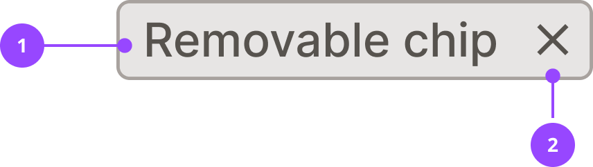
- Label
- Remove button
Basic usage
Edit live code
Variants
Removable chip
Removable chips act as tags or filters that can be removed. These are commonly used for multiple selections, filtering, or user-generated labelling.
These chips contain a remove button on the right side of the chip, which has a hover state and can be pressed to remove the chip.
Do not use a removable chip if:
- The user needs the information to remain persistent at all times, since it will disappear once removed
- There is no way to add a chip, as this may create an irreversible action
Future chip variants
Only the removable chip is available at the moment. Future variants may be added to support more use cases. These may include:
- Select chip
- Date chip
- Search chip
- Boolean chip
Features
Truncation
Edit live code
Chips are intended to be small components and have a maximum width of 200px.
When the chip’s title is too long to fit within the available space, the label is truncated with an ellipsis. The full title is disclosed in a tooltip on hover, or when the chip receives focus.
Custom tooltip
Edit live code
You may want to provide custom tooltip content on a chip, for instance if an acronym is used or the chip is part of a hierarchy and the parent needs to be displayed. Provide this to the chip using the tooltip prop.
Edit live code
Custom tooltips will be shown even when the chip is truncated. To avoid confusion, ensure the tooltip works as a clear label for the chip when read on its own.
Chip group
Edit live code
Accessibility
Keyboard interaction
Removable chips receive focus on the remove button by pressing the Tab key. This focus is visually presented as being on the whole chip.
Pressing the Enter or Space keys triggers the onRemove function, which the parent component of the chip can use to remove it and trigger any related actions, e.g. removal of a filter.
Screen readers
Screen reader software reads out the label of the chip, or if the chip is truncated it reads out the tooltip.
When a custom tooltip is provided via the tooltip prop, it serves as the accessible name for the component, replacing the visible label for screen reader users. It's therefore critical that the tooltip is clear when read on its own.
For removable chips, screen reader software will also read out ‘press to remove' after the label or tooltip.
Content
Label
- Keep labels concise (ideally 1–3 words)
- Use sentence case
- If using an acronym, you must provide the expanded term in a tooltip
Tooltip
- Should only be used if the label is not sufficient
- Should not just repeat the label
- Must make sense as a standalone replacement for the label, as it will be the only text read by screen readers
Don't
- For chip ‘MSN’ - MSN
- For chip ‘General enquiry’ - Billing
Do
- For chip ‘MSN’ - Meter Serial Number
- For chip ‘General enquiry’ - General enquiry / Billing
Properties
| Name | Values | Default |
|---|---|---|
children (required) | ReactNode | |
tooltip | ReactNode | |
onRemove | Function |