Combobox Field
Combo box is a searchable multi select field with the ability to nest options into sub-menus.
Overview
Combobox fields are a searchable, multi-select popover, with the ability to nest options into groups and sub groups.
When to use
- When a presenting a list with more than 20 options, making it difficult to scan through quickly.
- When a user is familiar with the options so searching enables a quicker interaction.
- When multi select is required.
- When options need to be nested into groups or sub groups.
When not to use
- For a small number of options - use Radio or Checkbox instead
- For a flat list of options that do not need to be searchable - use Select Field instead
Anatomy
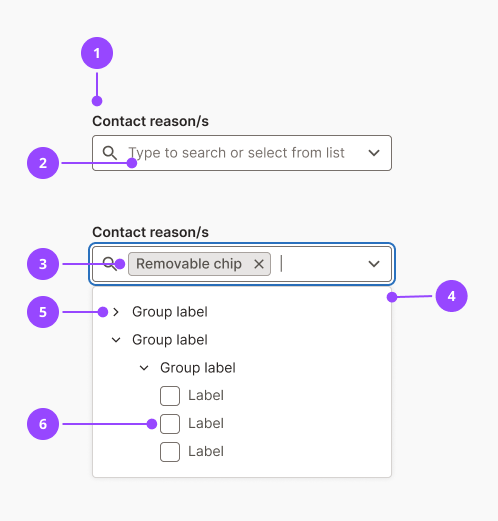
- Label
- Placeholder text
- Removable chip
- List options popover
- Group label
- List options
Basic usage
Edit live code
Variants
Flat list
When options have no nested structure, pass a flat list of checkbox options.
Edit live code
Grouped options
Pass nested options arrays to organise items under collapsible group headers. Groups can be nested up to two levels deep.
Edit live code
Features
Default interaction
When a user interacts with the field the popover opens by default displaying the groups and/or options.
The groups can be opened by clicking on them or via keyboard interaction.
The options can then be selected by clicking on them or via keyboard interaction.
Search
As soon as a user types into the field, the popover filters to show only matching options. Both selectable items and group headers are included in the search.
| Search result | Behaviour |
|---|---|
| Group labels that match search term | Group displayed open with all children visible |
| List options that match search term | Group label displayed open with matching list option visible. Other list options in group are hidden. |
| No results | “No results found” message shown in popover |
Chip selection
When an item is selected it appears as a Removable Chip inside the input field. Chips wrap onto new lines if they exceed the available width, and the input grows vertically to accommodate them. Long chip labels are truncated with an ellipsis; the full label is shown in a tooltip on hover or focus.
Chips are ordered with the most recently selected item to the right. To deselect an item, click the remove button on the chip, or use keyboard controls.
Accessibility
Keyboard interaction
| Location | Key | Action |
|---|---|---|
| Text input | Tab | Focus the field |
| Text input | Arrow down | Move focus to the first item in the dropdown |
| Text input | Arrow left (caret at start) | Move focus to the rightmost chip |
| Text input | Backspace (caret at start) | Remove the rightmost chip |
| Chip | Arrow left | Move focus to the previous chip |
| Chip | Arrow right | Move focus to the next chip (or back to the text input) |
| Chip | Backspace, Enter, Delete | Remove the focused chip |
| Dropdown item | Arrow up / Arrow down | Navigate between visible items |
| Dropdown group header | Enter | Toggle the group open or closed |
| Dropdown selectable item | Enter | Select or deselect the item |
Screen readers
The field is announced to screen readers as a combobox, this is a browser default behaviour inline with W3C guidelines (opens in new window) . When the popover opens, the screen reader announces the field label and that the user can type to narrow the options.
Group item titles are read out with the amount of items selected within that group.
Removable chip screen reader behaviour can be found here.
Content
Label
- The field label should describe the category of items being selected, not the action of selecting them.
Hint text
- Use hint text to give specific context to the fields requirement.
Placeholder text
- Never use placeholder text as a substitute for a label or hint, it disappears on interaction and is inaccessible
Group headers
- Avoid creating a group for a single item.
- Avoid generic group names like "Other" or "Miscellaneous" unless absolutely necessary.
Selectable option labels
- Always use sentence case for option labels.
- Avoid repeating the group name in child option labels.
- Avoid option labels longer than 5–6 words
Properties
| Name | Values | Default |
|---|---|---|
id (required)Unique identifier for the field | String | |
label (required)Visible label for the field | String | |
options (required)Array of selectable options. Each option has a label, value, and optional nested options array for grouping. | Option[] | |
onValueChangeCallback fired when the selection changes | (newValue: string[]) => void | |
valueControlled selected values | string[] | |
defaultValueInitial selected values for uncontrolled usage | string[] | [] |
name | String | |
optionalDisplays an optional indicator on the label | Boolean | false |
hintHint text displayed below the label | ReactNode | |
errorError message displayed below the field | ReactNode | |
fullWidth | alwaysneversmall | small |