On this page
Progress Stepper
Shows a user's progress through a multi-step form, and what's coming next.
Overview
Progress Stepper shows a user's position in a multi-step form. It's for orientation only - it doesn't let users navigate back to a previous step by clicking on it.
Progress Stepper is built on top of Progress Bar's stepped variant.
When to use
- For multi-step forms with 3 to 8 steps, to help users understand where they are and how much is left
- To show what's coming up next, alongside where the user currently is
When not to use
- For flows with more than 8 steps - restructure the flow into stages before reaching for this component
- To let users navigate back to a previous step by clicking on it - Progress Stepper is a display-only indicator. Use a Text Link or CTA Button if you need explicit back navigation
Whether a 2-step flow should show a persistent progress indicator at all is still undecided.
Anatomy
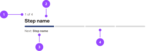
- Step counter: the current step number and total step count, for example 1 of 4
- Current step name: the name of the step the user is on
- Next step label: a preview of what's coming next, for example Next: Delivery address
- Progress bar: a segmented bar, one segment per step, filled up to the current step
Basic usage
Edit live code
<ProgressStepper
  currentStep={2}
  steps={['Your details', 'Delivery address', 'Payment', 'Review']}
/>
The current step name and next-step label are both derived from steps. currentStep is 1-indexed, matching the step counter shown to the user.
Final step
When the user is on the final step, there's no next step name to show. Use finalStepLabel to set what appears instead - for example, "Finish" if submitting is immediate, or the name of a review step if one follows.
Edit live code
<ProgressStepper
  currentStep={4}
  steps={['Your details', 'Delivery address', 'Payment', 'Review']}
  finalStepLabel="Finish"
/>
Accessibility
Heading level
The current step name always has the visual style of Heading3, but the actual element it renders as should change depending on where it sits on the page. Use headingAs to set this, in the same way you'd use the as prop on a Heading component.
This defaults to h2, since the standard Page component already owns the page's h1. If you're using an older Page component from before this convention existed, set headingAs to whatever level is actually correct for that page, rather than relying on the default.
Step counter
The current step heading's accessible name is set via aria-label (for example "Step 1 of 4, Your details"), so the whole heading - step count and step name - is announced correctly as one piece to screen readers.
role="progressbar"
Progress Stepper doesn't use role="progressbar" on any wrapper. Per the ARIA spec, this role forces role="presentation" onto every descendant element, which would strip the semantics from the step name heading above. role="progressbar" is intended for a continuously-updating task, such as a file upload, not a static indicator that the user has already navigated to by hand.
The progress bar
The segmented bar underneath the heading is aria-hidden. It only reinforces information the step counter and step name already give in readable text, so hiding it avoids repeating the same content twice for screen reader users.
aria-current
Progress Stepper doesn't use aria-current. There's no set of individually labelled steps for it to point at - each segment in the bar is a plain block of colour, not a separately labelled step - so the step counter and heading carry this information instead.
Content
Step names
- Keep step names short - long names may wrap awkwardly within the bar
- Use a noun phrase that describes the step's content (for example, "Delivery address"), rather than an instruction (for example, "Enter your delivery address")
Final step label
- Match the label to what actually happens next - use "Finish" only when submitting is the very next action, and use the name of the following step if a review or confirmation step comes first
Properties
| Name | Values | Default |
|---|---|---|
currentStep (required)1-indexed. | number | |
steps (required) | string[] | |
finalStepLabel | string | Finish |
headingAs | stringComponentType | h2 |
... | JSX.IntrinsicElements["div"] |