Overview
When to use
- To inform the user about the result of an action they have taken
- To inform the user about a system change
- To draw the user's attention to something important, timely and relevant to their current task
- Only when necessary - overuse of notifications, or using them in the wrong place, can lead to alert fatigue
Anatomy
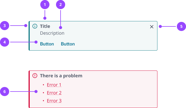
- Title
- Description
- Icon
- Actions
- Close button
- Error list: Required for error summaries on forms.
Basic usage
Edit live code
Variants
Standard notifications
There are four standard variants:
- Info: Provide additional information relevant to the current context
- Success: Confirm an action was completed as expected
- Warning: Let the user know they're taking an action that is undesirable, or which might have unexpected results
- Error: Explain something has gone wrong, and what, if anything, the user can do to correct the problem
Edit live code
Error summary notification
Error summary notifications are a special variant of the notification component, used to summarise all the errors on a form in a single notification.
In code, this is a separate component called ErrorSummaryNotification.
Edit live code
Always have the ErrorSummaryNotification on the page, and pass any errors to it when forms are submitted. The notification will remain hidden until errors are received.
With correct use, the following will happen automatically:
- Keyboard focus will move to the error summary when it is shown
- Each listed error will link to its respective field
Edit live code
Dismissal
Notifications are optionally dismissible. Do not make a notification dismissible if it is critical for a user to read or interact with the notification, or if they may need to refer back to it during their task.
Use the onDismiss prop if you need to perform an action when the notification is dismissed, such updating local storage. Consider the required behaviour, for instance whether the notification should be dismissed forever on this device, until the next session, or until the next page load.
Edit live code
Actions
Notifications can optionally include up to two actions.
Actions are buttons and should not be used for navigation. If you need to navigate the user to a different page, use a TextLink in the main body of the notification instead.
Do not use an action for dismissal, use the dismissible property instead.
Edit live code
Formatting
Colours and icons
Notifications use colours and icons convey the tone and priority of the information they contain.
The use of standard colour palettes ensures a universal and accessible experience. The colours and how they are used in the notification should not be changed. For instance, do not change the colour of the title, and do not create custom colour combinations.
The icon helps to avoid dependency on colour to communicate meaning. The icon is tied to the variant, and should not be overridden or removed.
Sizing
Notifications should expand to fill the width of their container. Height is based on content.
Placement
Place notifications close to the content they relate to. In most cases, this should be directly under the most relevant heading
When using notifications in forms:
- For information the user needs to know before they start, place a notification at the top of the form. Use this sparingly, and consider whether it definitely needs to be a notification.
- For a conditional warning based on the data a user has entered into a form, for instance for a valid but unusual set of field values, you can place a warning notification directly above the submit button. Always consider whether you can change the form design to avoid this scenario.
- When there are validation errors on form submission, always place an error summary at the top of the form.
Site-wide notifications, for instance about upcoming maintenance, should be placed at the very top of the page, above all headings.
Edit live code
Multiple notifications
Notifications should be used sparingly, and ideally no more than one per page.
Some pages, such as dashboards, may have multiple independent panels. Notifications on these pages should be limited to one per panel.
If you cannot avoid using multiple notifications, these should be placed in line with placement guidance. When there are multiple notifications in the same place, stack these vertically in order of importance. Never place notifications side-by-side.
Single-line notifications
By default, titles and descriptions appear on separate lines. For short notifications, it may be preferable to put everything on one line in order to save space.
You can achieve this by not passing in a title, and making the first few words of your description bold, giving these words the appearance of a title. Use a non-bold hyphen between the bold and non-bold text.
Edit live code
Content
Writing titles
Titles should convey the most important piece of information. Titles are optional, but should always be used when you want to catch the users attention, or when you need to create hierarchy in the notification.
A well-written title should:
- Be a statement (not a question), ideally no more than 5 words
- Use simple, direct language, and avoid technical jargon
- Leave out possessive adjectives ('your') and subjects ('the system') when the context is clear
- Use the past tense to indicate completed actions, such as 'submitted' or 'sent'
- Use an active voice rather than a passive voice, for instance 'sent' rather than 'was sent'
- Avoid unnecessary qualifiers, for instance if 'sent' implies success, don't use 'successfully sent'
- Be scannable - when you use a title, do not assume the user will also read the description
- Not use full stops or exclamation marks
An error summary always has the title 'There is a problem'. Avoid changing this unless absolutely necessary, so that errors across the platform are communicated in a consistent way.
Don't:
- Your meter read was successfully submitted to the system.
- The bill was generated and issued to the selected customer!
Do:
- Meter read submitted
- Bill sent
Writing descriptions
Notifications always include a description.
Descriptions should be written in similar language to titles, but can be longer to provide more context or information. Aim to limit the content to one or two short sentences, and ideally no more than two lines.
If you do need more content, this can be passed into the description property. Consider carefully if more content is actually needed.
Error summary notifications don't have a description by default, but a description can be passed into the notification and will appear above the list of errors.
Descriptions can contain links if you need to direct the user to another page.
A good description should:
- Not repeat or paraphrase the title
- Not contain questions, which can be confusing
- Avoid bold text, as this will compete with the title
- Not use full stops for a single sentence
- Follow the same language guidelines as titles
Don't:
- Bill sent
Bill has been sent to the customer and will reach them soon. - Meter read submitted
Reading can take 30 seconds to be accepted by the system and appear in the reads table below. Refresh to see updates?
Do:
- Bill sent
Postal bills typically arrive in 3-5 working days - Meter read submitted
May take up to 30 seconds to appear in the reads table. Refresh to see updates.
Writing errors
Systems will always encounter errors, and it's essential that we communicate clearly to the user what's happened and what they can do about it.
Error messages can be written in a few different ways:
- An instruction error message is where you just tell the user what to do
- A description error message is where you provide a description of what’s wrong and then what to do
For example, a user needs to enter their first name into a field. An instruction error message is ‘Enter your first name’. A description error message is ‘First name must be 35 characters or fewer’ where the user has provided too many characters. Which you use depends on your context, and what sounds more natural, human, and helpful.
Error messages should follow the same guidance for titles and descriptions as other notifications. Additionally, a good error message should:
- Describe what has happened or what’s wrong
- Avoid ambiguous words and phrases, such as 'an error occurred' or 'invalid' - explain what the error is, or the specific rule that makes something invalid
- Avoid jargon - it may be fine to provide error codes for debugging, but this should only ever be supplementary to human language
- Avoid pleasantries, such as 'please' and 'sorry'
- Avoid whimsical words, such as 'oops'
- Not sound accusatory, or make the user feel stupid
- Tell them how to fix it or what to do next
- If related to an input field, for instance as part of an error summary notification, use the same wording as the error messages which appear next to the input (unless those messages contain links - do not include those as these messages get wrapped in a link)
Don't:
- No access to this page, sorry!
Do you have the right permissions? - You forgot to enter your first name
- Whoopsie daisy
An error occurred with http://api.kaluza.com/account/123455393/supplypoint/XRHHK123
Do:
- You don't have permission to view managed exceptions
If you need access, ask a system administrator - Enter your last name
- Supply point data unavailable
Refresh to try again. If this error persists, contact your team lead.
Focus management
When showing a notification it is recommended that you focus the element so that screen readers are alerted to the new content and taken to relevant location in the content.
In order for screen readers to anticipate that the notification is somewhere content may appear it should always be rendered on the page. Nebula notifications support this by making the component hidden when no children or title is passed.
Edit live code
Properties
Notification
| Name | Values | Default |
|---|---|---|
id (required) | String | |
title | ReactNode | |
variant | successinfowarningerror | info |
actionsArray of actions to display in the notification | { label: string; id: string; onClick: Function; }[] | |
dismissable | Boolean | false |
onDismissCallback after a notification has been dismissed | Function | |
noMarginRemove the default margin that appears at bottom of the notification when it is displayed | Boolean | |
...Spread to outer most div - the 'focus wrapper' | JSX.IntrinsicElements["div"] |
ErrorSummaryNotification
| Name | Values | Default |
|---|---|---|
id (required) | String | |
errors (required) | {id: string; message: ReactNode;}[] | |
title | ReactNode | There is a problem... |
actionsArray of actions to display in the notification | { label: string; id: string; onClick: Function; }[] | |
dismissable | Boolean | false |
onDismissCallback after a notification has been dismissed | Function | |
noMarginRemove the default margin that appears at bottom of the notification when it is displayed | Boolean | |
...Spread to outer most div - the 'focus wrapper' | JSX.IntrinsicElements["div"] |