On this page
Progress Bar
Shows how far through a process or task something is.
Overview
Progress Bar is a visual indicator of progress. It's used on its own to show progress toward a known amount, or an ongoing task with no known duration, and it's also the building block other components use to show progress in their own way. Progress Stepper, for example, uses Progress Bar's stepped variant internally.
When to use
- To show progress toward a known percentage, using the flat variant - for example, how much of a multi-part upload is complete
- To show that a task is running but its duration or completion amount isn't known, using the indeterminate variant - for example, while a file finishes uploading
- As the underlying progress indicator inside another component, using the stepped variant - this is how Progress Stepper shows progress through a form
When not to use
- To show progress through a multi-step form - use Progress Stepper instead, which is built on top of Progress Bar
- As an interactive element - Progress Bar isn't clickable and can't be used to navigate between steps or states
- On its own to communicate progress to screen reader users - Progress Bar has no ARIA role or attributes of its own, see Accessibility below
Anatomy
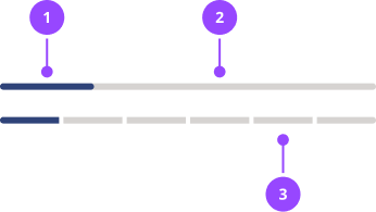
- Track: the full-width background showing the total extent of progress.
- Fill: the portion representing progress made so far.
- Steps: individual steps represented in the stepped variant. Both the track and fill are broken into equal segments.
Basic usage
Edit live code
<ProgressBar percentage={60} />
Progress Bar defaults to the flat variant, so percentage is the only prop you need for the most common case.
Variants
Flat (default)
Use to show progress toward a known percentage.
Edit live code
<ProgressBar percentage={70} />
percentage is clamped between 0 and 100.
Stepped
Use to show progress through a fixed number of discrete steps.
For multi-step forms, don't use this directly - use Progress Stepper instead, which adds the step counter, heading and next-step label around it.
Edit live code
<ProgressBar variant="stepped" currentStep={2} totalSteps={4} />
Each step renders as its own segment, filled up to currentStep.
Indeterminate
Use when a task is running but you can't calculate a percentage or step count for it.
Edit live code
<ProgressBar variant="indeterminate" />
The fill bounces continuously between the start and end of the track, rather than tracking a fixed amount. The animation is removed for users who have prefers-reduced-motion enabled.
Accessibility
Progress Bar has no ARIA role or attributes of its own, and this is a deliberate choice, not an oversight. The right accessibility treatment depends entirely on what Progress Bar is being used for, and different uses need different, sometimes conflicting, treatments:
- A progress bar showing an active, continuously-updating task - a file upload, for example - should expose role="progressbar" with aria-valuenow/aria-valuemin/aria-valuemax (or none of the value attributes, for the indeterminate variant).
- A progress bar used as a purely visual reinforcement of information already shown as text elsewhere - like the segmented bar inside Progress Stepper, which sits alongside a step counter and heading that already say the same thing in words - shouldn't expose role="progressbar" at all. Per the ARIA spec, browsers force role="presentation" onto every descendant of a progressbar element, which would silently strip any real content nested inside it (a heading, for example) of its own semantics.
Baking either of those into Progress Bar itself would be wrong for the other use case, so it stays unopinionated - add whichever ARIA fits your own use directly as props. Progress Bar forwards any extra props straight onto its rendered element, so there's no need to wrap it in an extra div.
Whenever you do add role="progressbar", it needs an accessible name - it takes that from aria-label/aria-labelledby only, never from visible text placed near it, so without one it's announced as an unnamed progress bar. If there's already a visible label on screen, point aria-labelledby at it rather than duplicating the text into aria-label. A couple of examples:
Continuously-updating progress (e.g. a file upload)
Edit live code
<>
  <P id="upload-label">invoice-2024.pdf</P>
  <ProgressBar
    percentage={70}
    role="progressbar"
    aria-labelledby="upload-label"
    aria-valuemin={0}
    aria-valuemax={100}
    aria-valuenow={70}
  />
</>
This is announced as one thing - "invoice-2024.pdf, progress bar, 70 percent".
For the indeterminate variant, omit aria-valuenow/aria-valuetext/aria-valuemin/aria-valuemax entirely - a progress bar with no known value shouldn't report one, and aria-valuemin/aria-valuemax default to 0/100 anyway (per the ARIA spec) with nothing for them to give context to once aria-valuenow is gone:
Edit live code
<ProgressBar variant="indeterminate" role="progressbar" aria-label="Uploading" />
A visual reinforcement of text shown elsewhere
If the surrounding component already states the same information as visible text - a step counter and heading, for example - mark the bar itself aria-hidden, rather than giving it its own role="progressbar":
Edit live code
<div>
  <P>Step 2 of 4</P>
  <ProgressBar
    variant="stepped"
    currentStep={2}
    totalSteps={4}
    aria-hidden="true"
  />
</div>
Properties
| Name | Values | Default |
|---|---|---|
variant | flatsteppedindeterminate | flat |
percentage0-100, clamped. Applies to the flat variant. | number | |
currentStepApplies to the stepped variant. | number | |
totalStepsApplies to the stepped variant. | number | |
... | JSX.IntrinsicElements["div"] |