Overview
When to use
- To give supplementary, non-critical context for focusable elements
- To clarify an inline word for phrase, with a definition tooltip
- To give controls without a visual label, like icon buttons, an optionally visible name
When not to use
- To provide critical information - always assume the user won’t see it
- When interactive elements need to be revealed, as these are inaccessible. We do not currently have a popover component, but may add this in future.
Anatomy
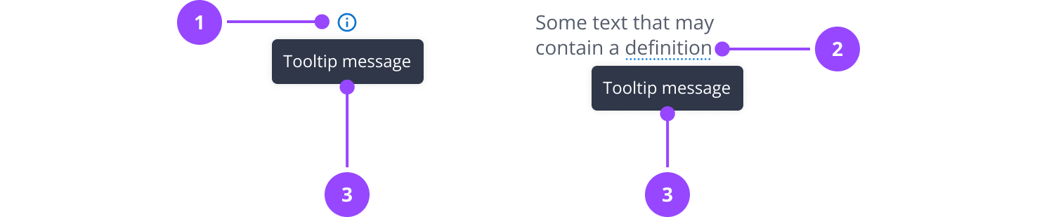
- Icon tooltip trigger
- Definition tooltip trigger
- Tooltip message
Basic usage
Tooltips display additional information upon hover or focus that is contextual, helpful, and nonessential. They should only be used when necessary to offer quick context without cluttering the interface.
Edit live code
Icon tooltips
This is a trigger that uses an icon to indicate a tooltip, and is the most common way we advise using tooltips.
- Use next to UI elements where additional, non-critical context will help the user make better decisions
- When using in summary lists, you can use them on labels or values, but not both at the same time
- Never use on form fields - use hint text instead
- Use sparingly to avoid cluttering the interface
Edit live code
Definition tooltips
The energy industry has lots of jargon, and it may be helpful to define certain terms or initialisms in context.
You can use a definition tooltip to do this. A definition tooltip is used to define terms or give extra help within text. It works well on UI labels, words in paragraphs, or compact spaces like data tables, where extra icons might clutter the interface.
Defined terms have a dotted underline using the info colour from the palette, and show a tooltip while hovering, or when receiving focus.
There is currently no central dictionary of terms, so try to avoid definitions that might contradict with others on other pages.
As with all tooltips, use definitions sparingly.
Edit live code
Custom tooltip trigger
While we advise using the Icon Tooltip and Definition Tooltip for most use cases, other UI elements may require context. Any focusable UI element can be used as a tooltip trigger.
Elements that act as a tooltip trigger should have a target size of at least 24px to meet accessibility standards.
Edit live code
Aria relationship
When creating a tooltip trigger, consider the relationship between element and tooltip.
By default, the tooltip will be given the role of description and screen readers will announce it in addition to the trigger content or label.
If the tooltip should act as a label (in cases where the trigger does not have an existing label or content), you should instead give it the relationship of label.
Edit live code
This an just example to show a trigger without its own label, we do not recommend creating CTAs with just an icon.
Tooltip placement
Tooltips are placed centred below the trigger by default. Avoid changing this unless absolutely necessary. If you do need to, you can place the tooltip above, to the left, or to the right of the trigger.
You should never place the trigger to the left or right, unless the trigger is fixed to the left or right edge of the screen.
There is horizontal collision detection in tooltips. This means that if centring would push the tooltip off the page, it will shift left or right to remain in view.
Edit live code
Delay
By default there is a 100ms delay, and then 200ms animation.
However, in some scenarios, where a user is commonly interacting with the element but doesn't need to see the tooltip every time, that may be annoying. A good example of this is an icon button.
In these cases, you can set an increased delay, which means the tooltip only shows after 1.5 seconds.
You can see this behaviour on the navigation controls in the DatepickerField.
Edit live code
Custom boundary
By default the tooltip checks the screen boundary when offsetting position to prevent appearing off screen.
It is also possible to declare another container for the tooltip to check instead using the data-nebula-tooltip-boundary attribute. This can be useful when the tooltip appears inside an element with overflow: hidden or when there are fixed elements on screen.
Edit live code
Note that the tooltip must be a child of the custom boundary and it will use the closest one it can find.
Keyboard navigation
Tooltips show when the user tabs to the focusable element they are placed on. Tooltips do not receive focus themselves, and you should never put interactive elements inside them.
Content
Writing better labels
If you can avoid using tooltips, you should, because tooltips hide information from users. It is often better to improve the clarity of labels than to explain a poorly-written label in a tooltip.
Don't:
- Download data Downloaded data is up to the last 12 months
- View data View meter data for account 12345678
Do:
- Download last 12 months data
- View meter data (you do not need a tooltip to specify the account, as it is likely obvious from the context)
Writing tooltips
Tooltips only have the user's attention temporarily, so it's important that they are clear and concise.
A good tooltip should:
- Contain relevant, specific copy
- Not contain essential task instructions - since a tooltip disappears when hover or focus state ends, it can cause frustration if the user must repeatedly hover in order to understand how to complete their task
- For icon-only components, like icon buttons, provide a concise one- or two-word description of the control's function
- For definitions and instructive tooltips, use sentence case and be complete sentences
Properties
| Name | Values | Default |
|---|---|---|
tooltip (required) | ReactNode | |
placement | topbottomleftright | bottom |
delay | Boolean | false |
... | JSX.IntrinsicElements["button"] |