Monthpicker Field
Monthpicker Fields allow users to input a month and year using a calendar popup or free text.
Overview
When to use
- When asking the user to select a month, where the specific day isn’t meaningful to the task, for instance when viewing a billing period or usage period
- When it's useful for the user to be able to browse nearby months for context, or to see available months
- When months could span far into the past or future, and scrolling through individual days would be inefficient
When not to use
- When the user needs to provide an exact date - use Datepicker Field instead
- When choosing from a small, fixed set of months, for instance only the last three billing periods - use Select Field or Radio instead. Browsing a calendar adds interaction cost when there’s nothing to browse
Anatomy
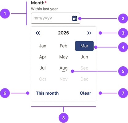
- Monthpicker field: Based on Text Field. Contains label, hint text, input and error state.
- Calendar button: Pressing the calendar opens the calendar popover.
- Year controls: Moves the year forwards and backwards.
- Selected month
- Today's month
- This month button: Selects today's month and closes the calendar popover.
- Clear button: Clears the current entry and closes the calendar popover.
- Calendar popover: The menu where the month is selected. The calendar popover is always a fixed width, and always aligned to the left edge of the monthpicker field.
Basic usage
Edit live code
Month format and validation
MonthpickerField uses the mm/yyyy format for months and will use this format when selecting a month from the popover. The popover will attempt to parse the input value in order to show which month is selected.
The input itself is a TextInput that the user can freely enter text into and you should always validate user input when the form is submitted.
Nebula exports the function getMonthpickerDate which can be used to validate the string entered by the user in the MonthpickerField text input and that returns either a Date if valid or null if not.
Edit live code
Getting the month and year: getMonthpickerDate always returns a Date pinned to the 1st of the selected month, so the day can be ignored. Use date.getMonth() + 1 for the month and date.getFullYear() for the year. Remember that Javascript Date (opens in new window) months are zero-indexed, so getMonth() returns 0 for January.
Content
Writing labels
The Monthpicker Field label should always be a noun that describes the month. It should be no more than two or three words.
Don't try to make the label and month function as a sentence, such as 'Billing for {month input}'. This is harder for users to follow, and harder to communicate errors, for instance 'Enter a valid billing for' does not make sense as an error message.
Don't:
- Billing for
- Month meter reading submitted
- The month you want to install
- Renewing on
Do:
- Billing month
- Statement month
- Installation month
- Renewal month
Writing hints
Hint text may be used to help the user understand additional validation constraints on the month. The Monthpicker Field has placeholder text that specifies the format of a valid month, so it is not necessary to include the format as a hint.
Keep any extra guidance short, and avoid trying to write full sentences. Where possible, hint text should describe a valid month, not an invalid month.
Don't:
- Month
Months before this year unavailable - Renewal month
Please pick a month no more than 12 months from today
Do:
- Month
This year only - Renewal month
Within the next 12 months
Variations
Validation Error
Edit live code
Input size
Monthpicker input size is determined by a combination of the fullWidth and characters properties. By default, monthpicker inputs are an appropriate width for the expected input and stretch to full width below the smallest breakpoint.
Generally it is recommended to use the default behaviour, but in some cases you may want to set the width of the input to a specific size.
The responsive full width behaviour can be overridden by setting fullWidth="always" and fullWidth="never".
Edit live code
The default width itself can be overridden using the characters property, which approximates how many characters should fit into the input.
Edit live code
Unavailable months
It is possible to mark certain months as unavailable in the popover. Provide a callback to the isMonthUnavailable property to test if a given month should be unavailable.
Note that this will not prevent the user from manually entering these months so it is important to validate the input when the form is submitted.
Edit live code
Month ranges
The Monthpicker Field doesn't yet support selecting month ranges in a single field. Until it does, use two Monthpicker Fields side-by-side.
To create a relationship between the two fields, use the isMonthUnavailable property. Set months before the start month as unavailable in the end month field. Reset the end month when the start month is changed to avoid the user getting stuck.
Align side-by-side Monthpicker Fields to the bottom of the container, so that when fields have different heights (for instance when one field has hint text or an error message) the inputs remain aligned.
Edit live code
Avoid additional, overarching labels for month ranges. Instead, make the label for the start and end fields clear.
Don't:
Edit live code
Do:
Edit live code
Uncontrolled vs Controlled
It is recommended to use uncontrolled form inputs where possible (opens in new window) . When using an uncontrolled MonthpickerField you can pass a defaultValue.
Edit live code
Alternatively, you can control the input by passing value and onChange.
Edit live code
OverlayProvider
This component is built using the React Aria (opens in new window) . The OverlayProvider context provider is required to hide the content outside of the calendar popover from screen readers.
Properties
| Name | Values | Default |
|---|---|---|
id (required) | String | |
name | String | |
label (required) | String | |
optional | Boolean | false |
hint | ReactNode | |
error | ReactNode | |
characters | Number | 8 |
fullWidth | alwaysneversmall | small |
defaultValue | String | |
onChange(newValue: string) => void | Function | |
isMonthUnavailable(date: Date) => boolean | Function | |
... | JSX.IntrinsicElements["input"] |