Overview
When to use
- To organise different but related content
- To allow users to navigate a topic, entity or task without leaving the page
When not to use
- To indicate progress
- When users need to compare the information that will be split between tabs
- When you have need so many sections that tab labels can't horizontally fit on the page - consider an alternative way to organise this content
Anatomy
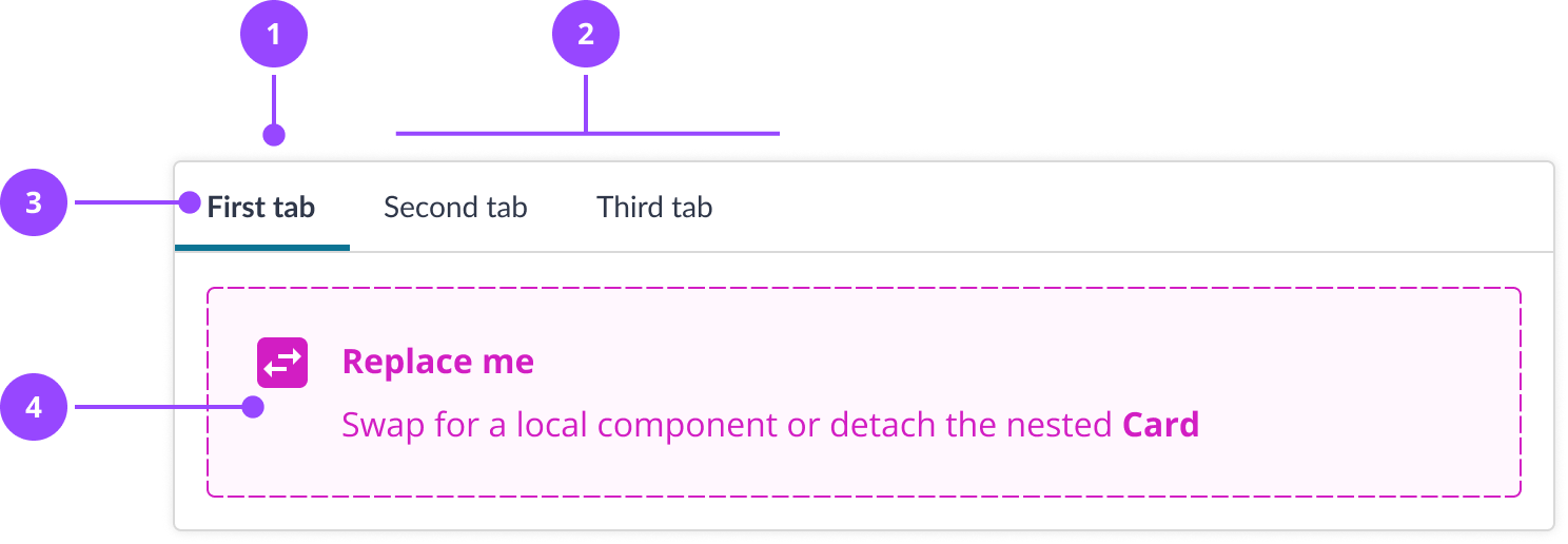
- Selected tab
- Unselected tabs
- Tab label
- Tab content
Basic usage
Tabs are a combination of components that are composed together. Tabs are based on the Card component and have similar behaviour in terms of elevation. Linking the tabs to panels is taken care of by the Tabs component.
Edit live code
Keyboard navigation
Tabs can be navigated with the left and right arrow keys (opens in new window) .
This will select a new tab and change the content to the corresponding panel. The active tab will be the only tabbable element, so the user can easily tab to other elements on the page.
Content
Writing tab labels
Each tab requires a tab label. A well-written tab label should:
- Be only 1 or 2 words, which is easier to scan
- Be clear and specific
- Be obviously related to the content it represents
- Use sentence case, except when using proper nouns (e.g. Direct Debit)
Don't:
Edit live code
Do:
Edit live code
Additional content in tab labels
Tabs don't currently support additional content beyond tab labels, such as secondary labels or badges.
Where possible, avoid additional content where you can, as this can make tabs harder to scan. If you cannot avoid including additional content, aim to follow these guidelines:
- Do not add interactive elements to tab labels, such as buttons
- Do not add badges to more than one tab label, as this can make it less clear which tab is selected
- Do not add icons to tabs
- When tab labels include multiple pieces of information, organise by type, then identifier, then status. For instance:
Edit live code
Some of these things may be officially supported in future.
Variations
Default selected
You can set the default selected tab with the defaultSelected prop.
Edit live code
Controlled
Tabs manage their own state by default, but they can also be manually controlled using value and onSelected.
Edit live code
Inline
Like Cards, tabs that are placed inside of a raised component can be flattened by using adding the inline property.
Edit live code
Properties
Tabs
| Name | Values | Default |
|---|---|---|
defaultSelectedAn zero based index of the default active tab | Number | |
valueAn zero based index of the current active tab, use with onSelected | Number | |
onSelectedA callback function that will receive the selected tab index | Function | |
inline | Boolean | false |
... | JSX.IntrinsicElements["div"] |
TabList
| Name | Values | Default |
|---|---|---|
... | JSX.IntrinsicElements["ul"] |
Tab
| Name | Values | Default |
|---|---|---|
onClickCalled in addition to selecting a tab. e.g. analytics | Function | |
... | JSX.IntrinsicElements["li"] |
TabPanel
| Name | Values | Default |
|---|---|---|
... | JSX.IntrinsicElements["section"] |