Radio
Radios are used to choose between multiple options.
Overview
When to use
- To let users choose a single option
- To make sure users see all the options
When not to use
- To let users select multiple options - use a Checkbox Field instead
- When there are a large number of options - use a Select Field instead
Anatomy
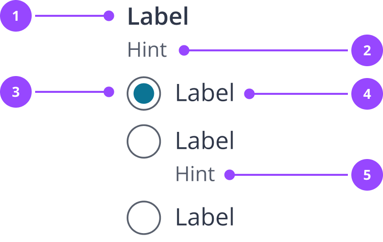
- Field Label
- Field hint
- Radio input
- Option label
- Option hint
Basic usage
RadioField expects Radio elements as its direct children in order to set the correct name, value, and error properties.
Horizontal layout
By default, options are laid out vertically as this is easier to read.
However, a horizontal layout is available where it is important to save space, or you have a very simple question that requires little attention from the user to comprehend, e.g. a yes/no question.
Only use horizontal layouts when:
- There are only 2-3 options
- Options have short labels (no more than 2-3 words)
- Options do not require hints
Edit live code
Accessibility
Labels
Radio groups need a group label, which should always sit aligned above it. This label allows users to understand what to enter as well as auto focussing the input which creates a larger touch target.
Content
Field labels
- Should be a clear and concise description of the field, written as a statement
- Should never be part of a sentence that is completed by the input, e.g. ‘I am based…’ with options ‘in the UK’ and ‘outside the UK’ - in this example, it’s better to use ‘Based in the UK’ with options for ‘Yes’ and ‘No’
Field hint
- Should only be used if the field label is not clear enough on its own
- Should clarify the field without repeating the field label
- Lead with any imperative, e.g. ‘Must…’
- Avoid using pleasantries, e.g. ‘Please…’
- Can be used to to indicate severity, e.g. ‘Can be changed later’, or ‘If you don’t know, choose the option that is the best fit'
- Should be used to explain any constraints on the options that the user may otherwise be confused by, e.g. if picking a t-shirt size, but ‘Large’ is not an option you offer, this can be explained in a hint
Edit live code
Option label
- Should be a clear and concise description of the option, written in language the user will recognise
- Should be mutually exclusive from other options (in the user’s view)
- Together with other options should be collectively exhaustive, unless explained in the field hint
Option hint
- Should only be used if the option label is not clear enough on its own
- Should only be used on options that require them - if you use an option hint on one option, you do not need to use them on every option
- Can be used to give alternative names for the same term, if multiple terms are used in the user’s context
- Can be used to give examples, if the option label is abstract, e.g. for the option ‘Government issued ID’, you may want to add the option hint ‘For instance a passport, driving licence, or national ID card’
Edit live code
Properties
RadioField
| Name | Values | Default |
|---|---|---|
name (required)Radios are treated as a single field | String | |
label (required) | ReactNode | |
optional | Boolean | false |
hint | ReactNode | |
error | ReactNode | |
value | String | |
onValueChange(newValue) => null | Function | |
defaultValueThe default selected radio | String | |
horizontalHorizontal layout support | Boolean | |
... | JSX.IntrinsicElements["fieldset"] |
Radio
| Name | Values | Default |
|---|---|---|
id (required) | String | |
label (required) | ReactNode | |
value | String | |
hint | ReactNode | |
... | JSX.IntrinsicElements["input"] |