Page
A standardised page layout including waymarkers and page-level actions.
Overview
When to use
- All standard application pages, including dashboards, informational pages, and task flows
When not to use
- Marketing pages
- Landing pages
- Modals - use the Modal component instead
Anatomy
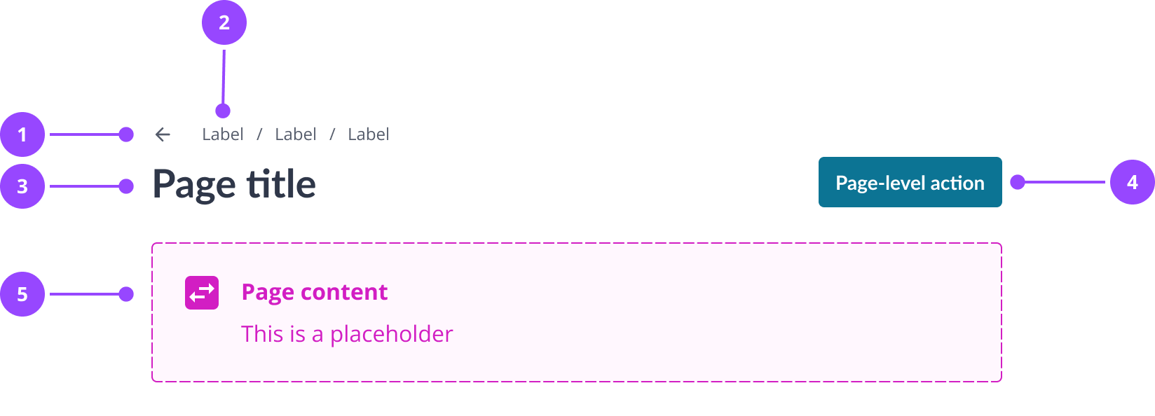
- Back button
- Breadcrumbs
- Page title
- Page-level action
- Page content
Basic usage
Edit live code
Variants
Max width
By default the page has a max width of 1600px, but this can be disabled by passing maxWidth="none" to the Page component.
Only use maxWidth="none" when your page needs the full width of the page (i.e. more than 1600px width), this may be because you have wide tables, multiple columns, or your page is a dashboard.
Note that due to the below 1600px max width of the Nebula docs site content it's not really possible to preview this functionality here.
Page actions
Use a page action when there is a clear action that is relevant for the whole page. For instance, on the ‘Transactions’ page this might be ‘Add transaction’.
Guidelines:
- Only use page actions where they are relevant to the entire page
- Include no more than one primary action and one secondary action per page
- Use a primary button when the action is likely to be the reason the user has visited the page (like adding a transaction) and a secondary button when it is more optional (like changing billing preferences)
- If your page action is a primary button, avoid using any other primary buttons on the page
- If the main route for the user is a button at the bottom of the page, for instance to submit a form, do not use any page actions
Edit live code
Without page actions
Edit live code
Waymarkers
The page component uses breadcrumbs and the back button as "waymarkers" to give users context on where they are.
Breadcrumbs can show how pages are nested or which domain the current page belongs to.
The back button gives users a quick way to go to the previous page. This may be helpful if the user likely needs to go back to a ‘hub’ page.
Guidelines:
- Always include breadcrumbs when the page has a parent page
- Always use breadcrumbs if a page does not appear in the main navigation, as this helps the user to understand where they are
- Do not use the back button for multi-step forms (except for the first step), where behaviour may be unpredictable
Edit live code
Without back link
Edit live code
Without waymarkers
Edit live code
Content
Writing page titles
Every page should have a title - a clear H1 on every page is essential for accessibility.
A good page title should:
- Clearly describe the current page and its purpose
- Use sentence case
- Avoid redundant or unnecessary words
- Not include punctuation like full stops or exclamation marks
- For pages that display information, use nouns that describe the information, e.g. ‘Payment arrangements’
- For pages where the user is completing a task, use a verb and noun phrase, e.g. ‘Make a payment’
Don't:
- View your payment arrangements
- New payment flow
- Add new
Do:
- Payment arrangements
- Make a payment
- Add meter reading
Arranging page content
To ensure layouts remain responsive and visually cohesive across the platform, use the Content Stack component within the page content area. This automatically handles spacing and responsiveness using semantic design tokens.
Content Stack (Vertical / Default)
The default state of the Content Stack, used to layer high-level content sections vertically with equal spacing. It is a variant of the Stack component designed to organise content such as cards, further nested Content Stacks, or other high-level content blocks into a clean, readable flow.
- Forces a strict vertical orientation. It ensures that different sections of the page maintain clear separation as the user scrolls.
- Automatically applies the betweenCards semantic space variable between stacked elements.
- Best for layering different groups of information on the page. For example, stacking a horizontal Content Stack of high level summary data items above a more detailed table.
Content Stack (Horizontal)
A variant of the Content Stack for arranging Card components side-by-side. Though it has been designed for cards, it can be used with other content. It prioritises a horizontal orientation but adapts based on available container width.
In code, this horizontal behavior is activated by applying the horizontal prop to the default Content Stack. In Figma, this is a separate component to allow for nesting, as the main Content Stack cannot contain instances of itself.
- Arranges items horizontally in equal widths by default. Automatically changes to a vertical stacked layout when the container width drops below 750px (or when cards cannot maintain a minimum width of 360px in Figma).
- Automatically applies the betweenCards semantic space variable between each card.
- Best for related sets of data, such as a row of high level data items, or a collection of objects of the same type.
Layout example
By nesting these components, you can create a fully responsive grid:
Edit live code
Properties
Page
| Name | Values | Default |
|---|---|---|
maxWidth | standardnone | standard |
... | JSX.IntrinsicElements["div"] |
Page.Header
| Name | Values | Default |
|---|---|---|
... | JSX.IntrinsicElements["div"] |
Page.Waymarkers
| Name | Values | Default |
|---|---|---|
... | JSX.IntrinsicElements["div"] |
Page.BackLink
| Name | Values | Default |
|---|---|---|
... | JSX.IntrinsicElements["a"] |
Page.Breadcrumbs
| Name | Values | Default |
|---|---|---|
breadcrumbs (required) | String[] | |
... | JSX.IntrinsicElements["ol"] |
Page.HeaderSection
| Name | Values | Default |
|---|---|---|
... | JSX.IntrinsicElements["div"] |
Page.Title
| Name | Values | Default |
|---|---|---|
... | JSX.IntrinsicElements["h1"] |
Page.Actions
| Name | Values | Default |
|---|---|---|
... | JSX.IntrinsicElements["div"] |
Page.Content
| Name | Values | Default |
|---|---|---|
... | JSX.IntrinsicElements["div"] |